
📈 The AI dashboard
Watch boom turn to bubble (or not) in real time

A month ago, we released our framework for assessing whether AI is a bubble. The framework uses five key gauges which measure various industry stressors and whether they are in a safe, cautious or danger zone. These zones have been back‑tested against several previous boom‑and‑bust cycles. As a reminder, we track:
Economic strain (capex as a share of GDP)
Industry strain (investment relative to revenue)
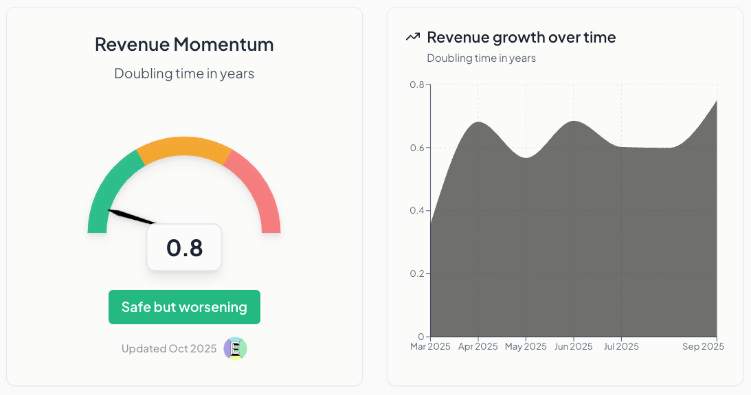
Revenue momentum (doubling time in years)
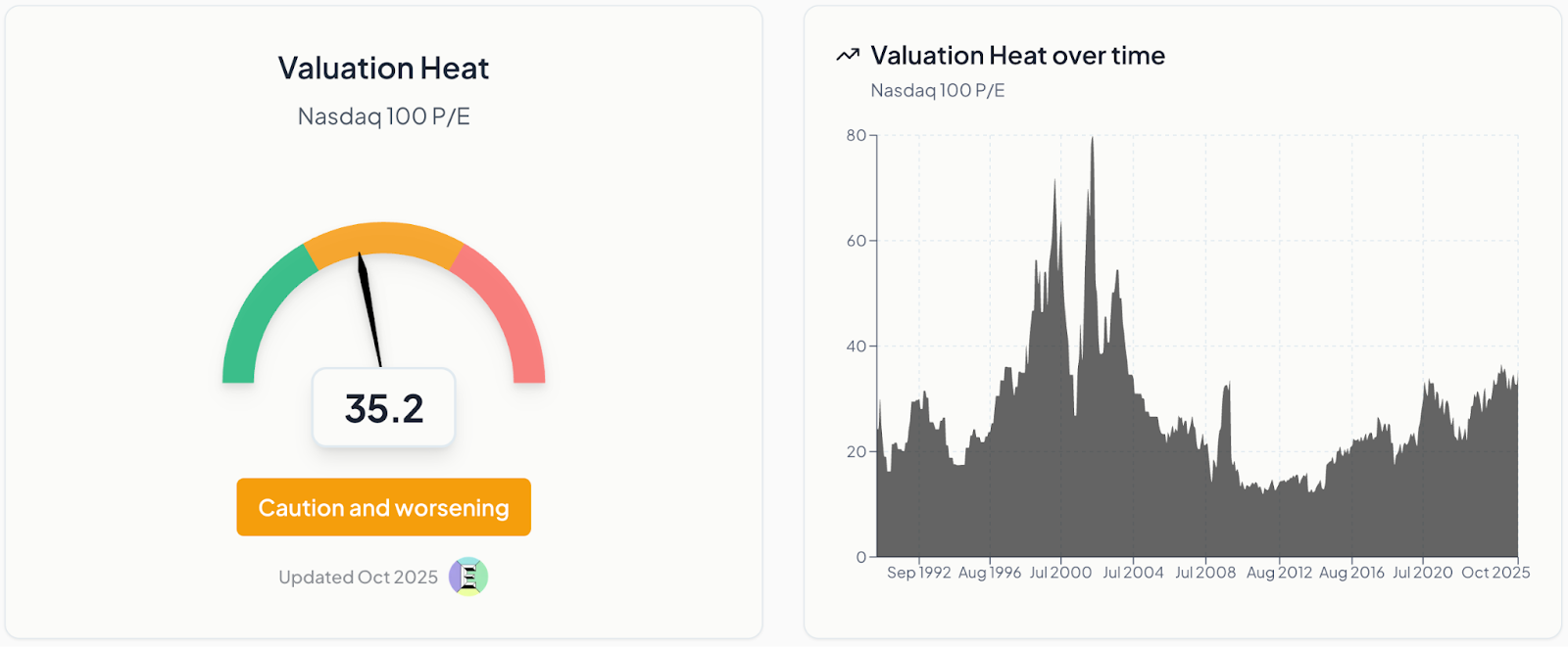
Valuation heat (Nasdaq‑100 P/E ratio)
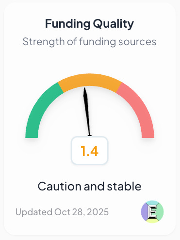
Funding quality (strength of funding sources)
The framework has circulated through boardrooms, investment memos, and policy circles – and today, we’re taking it a step further.
We are launching v1 of a live dashboard, updated in real time as new data comes in.
A month later, what’s different?
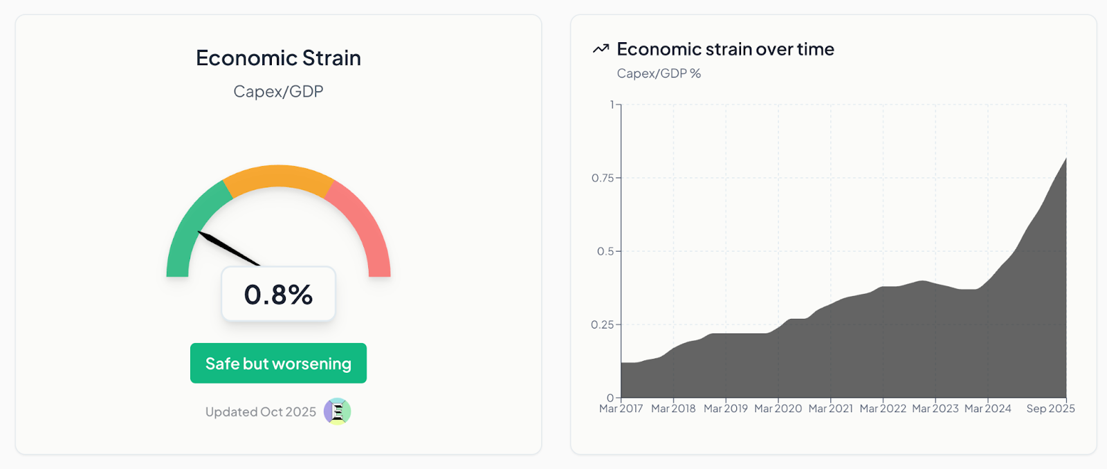
Economic strain
The economic strain gauge measures how much of the US economy is being consumed by AI infrastructure spend. We look at AI‑related capital expenditure in the US as a share of US GDP. This gauge is green if capex/GDP is below 1%; amber at 1–2%; and red once it crosses 2%. Historically, the three American railroad busts of the 19th century all exceeded 3%. The ratio was roughly 1% during the late 1990s telecoms expansion and a little higher during the dotcom bubble.
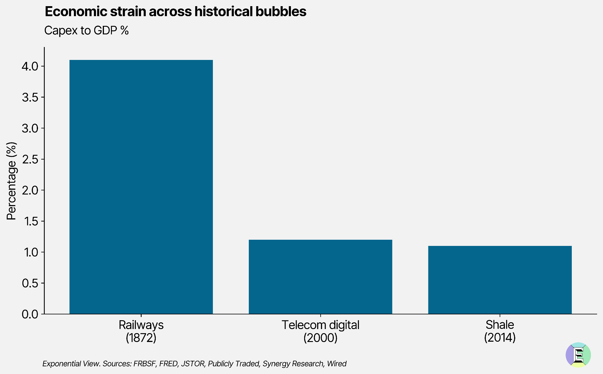
Since we last updated the dashboard, economic strain has increased but remains in safe territory. Google, Microsoft and Meta increased their collective capex by 11% compared to the previous quarter. Hyperscalers’ spending on AI infrastructure shows no sign of slowing.
Industry strain
Revenue is one of the key metrics we track to judge whether AI is a boom or a bubble. It feeds into two of our five gauges: revenue momentum (revenue doubling time) and industry strain, which measures whether revenue is keeping pace with investment. Investment usually comes before revenue. It’s a sign of optimism. But that optimism must be grounded in results: real customers spending real money.
This was one of the most challenging pieces of analysis to assemble, as reliable revenue data in the generative AI sector remains scarce and fragmented. Most companies disclose little detail, and what does exist is often inflated, duplicated or buried within broader cloud and software lines. Our model tackles this by tracing only de‑duplicated revenue: money actually changing hands for generative AI products and services. That means triangulating filings, disclosures and secondary datasets to isolate the signal. The result is a conservative but more realistic picture of the sector’s underlying economics. The simplified Sankey diagram below shows how we think about those flows.
Consumers and businesses pay for generative AI services, including chatbots, productivity tools such as Fyxer or Granola and direct API access.
Third‑party apps may rely on models from Anthropic, Google and others, or host their own.
Big tech firms, particularly Google and Meta, deploy generative AI internally to improve ad performance and productivity, blending proprietary and third‑party systems.
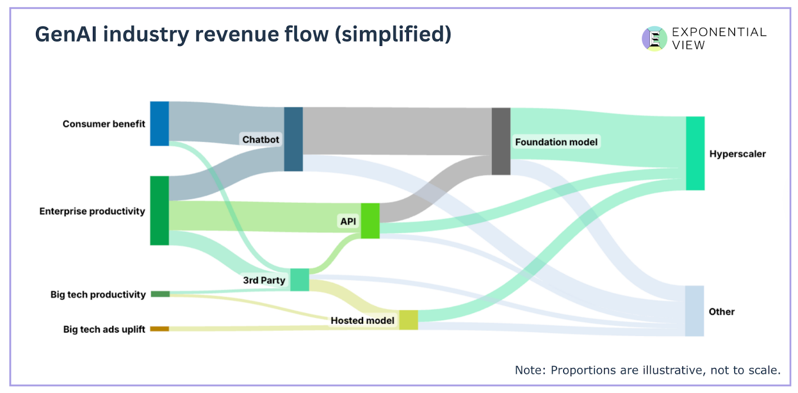
In this simplified public version, we group hyperscalers and neoclouds together and collapse smaller cost categories into “Other.” Flow sizes here are illustrative, but our full model tracks them precisely. (Get in touch if you want institutional access to our revenue data and modeling.)
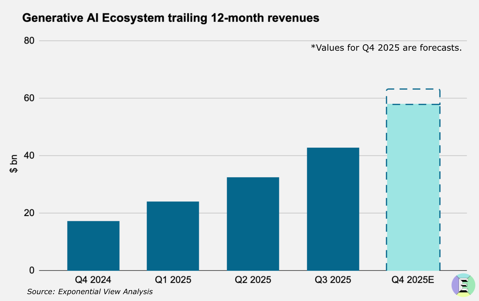
Back in September, we estimated that revenue covered about one‑sixth of the proposed industry capex. Our historical modeling put this in deep amber territory. We have now updated our models with an improved methodology and more recent data, and the results have changed the look of our dashboard.
It turns out industry strain is the first gauge to cross into red. Remember, zero or one reds indicate a boom. Two reds are cautionary. Three or more reds are imminent trouble and definite bubble territory.
The change in this indicator reflects our improved methodology. We now measure capex each quarter as a look‑back on the previous 12 months’ capex commitments, and revenue on the same basis. In September, we relied on our forecast for 2025 generative‑AI revenue, which included estimates through year‑end. The revised approach allows for more real‑time updates each quarter and helps us smooth short‑term volatility in revenue estimates.
We believe this indicator is improving, and recent events point in that direction. AI startups report rapid ARR growth, while hyperscalers attribute much of their recent gains to AI; Microsoft’s Azure revenue, for instance, rose 40% year over year.
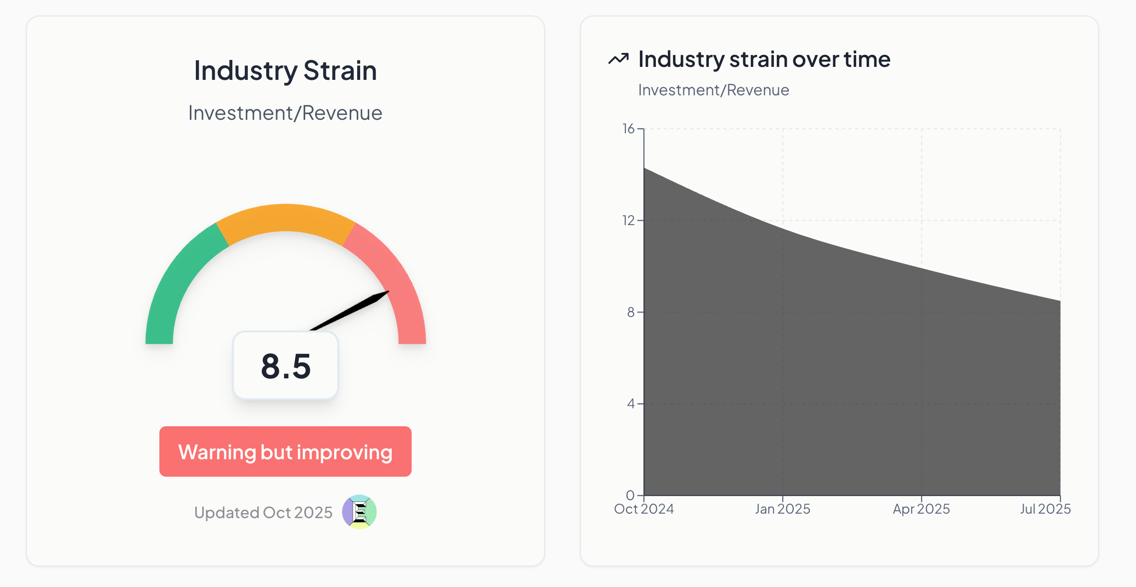
Our estimates of generative‑AI revenue now support quarterly (and even more fine‑grained) updates. The chart shows how trailing 12‑month revenue has grown over the past year. Our forecast for full‑year 2025 is $58 to $63 billion, likely near the higher end.
Revenue momentum
Revenue momentum estimates revenue doubling time in years. As we have said many times before, real revenue from real customers is what ultimately validates a technology. In our initial update in September, we showed revenue doubling every year. The new data now shows it doubling every 0.8 years, a further improvement. We describe it as “safe but worsening,” so let’s unpack the “worsening” part.
In our gauge, “worsening” simply means the doubling time is lengthening. In other words, it now takes longer for these revenues to double. As the sector expands and matures, a gradual increase in doubling time is expected. However, a rapid slowdown could signal emerging risk if growth cools before the market reaches maturity. This gauge works best in tandem with the industry‑strain indicator: high strain can be offset by exceptionally fast revenue doubling (as is the case now), and conversely, a sharp slowdown can push even moderate strain into red territory.
Valuation heat
Valuation heat measures how far investor optimism is running ahead of earnings reality. It captures when price‑to‑earnings multiples stretch beyond underlying profits. Extended multiples detached from earnings power are classic bubble signatures, while elevated but still anchored multiples are consistent with an installation phase of investment. This gauge has slightly worsened, rising from 32 to 35, but remains far below the dotcom peak of 72. The market is running hot but not yet irrational.
Funding quality
Funding quality has also slightly worsened. On our qualitative metric, it rose from 1.1 to 1.4, reflecting several events that raise questions about the stability of financing. These include Oracle’s $38 billion debt deal for two data centers, the subsequent spike in the cost to insure Oracle’s debt and Nvidia’s support for xAI’s $20 billion chip‑linked capital raise. Collectively, these moves suggest funding conditions are becoming more complex and carry slightly higher risk, even as underlying fundamentals, like cash flow coverage, remain broadly stable.
What’s next
Over the coming weeks and months, we’ll keep tracking the gauges and refining the model. In version 2, we plan to add several sub‑indicators to track AI startup valuations, circularity and GPU depreciation. We want the dashboard to be useful day‑to‑day for sense‑making, so we are internally testing a news feed that tracks changes in the gauges alongside the latest market events. We’ll roll that out as soon as it’s ready.
Tell us what would make the dashboard most useful to you.
If you are interested in institutional access to the modeling and data, get in touch.
This is an incredibly useful thinking tool amidst all the hype, thank you for building it
There's probably an additional data point/s to track follow, which I think Ben Thompson mentioned/alluded to. At the moment the limiting factor is the amount of chips (volume) that can be produced; largely TSMC's capacity for AI chips. Understandably, while TSMC are increasing capex they're being careful not to front run demand (despite how effusively they talk about the oppty). Everyone can want datacenters, can figure out how to fund them, power them, etc but if they can't get the chips then it's just future demand being booked early (i.e. will show up mostly just as longer waiting time for chips and higher prices, not massive volume growth - great for TSMC/NVDA/etc but not bubbly for AI).
You probably want to think of ways to measure things that impact that effective capacity including
- If/when their new fabs come online and/or yields improve there (e.g. TSMC Arizona looks like Taiwan)
- If others (Samsung's fab for X/Intel/etc) start producing AI chips in meaningful size
- If more work is shifted on device (so can use DRAM/NAND/etc. instead) meaning less data centers are needed.
I suspect you probably want to that effective capacity increase meaningfully before you're truly talking about a bubble.