


🔥📊 EV’s Charts of the Week #38
Welcome to Charts of the Week. This is a member’s-only mailout, but you are free to occasionally forward it to a friend if you think they will enjoy it.
Comments are open for Exponential View members to discuss and expand on the charts. Visit the website to discuss and comment.
DEPARTMENT OF THE BLUE DOT
It’s getting worse
The IPCC report was pretty gruesome. The two graphs above show the recent acceleration of the temperature anomaly. Via Time via Michael Mann
More extremes

The increase in the amount of energy in the atmosphere means many more extreme weather events. Roughly speaking, the 1.5ºC warming will mean a 12-fold increase in once-a-decade heat waves, rainstorms or droughts. Via Quartz
That increase won’t fall evenly across the globe

Most of the world will see increases in both heat and extreme rainfall. Droughts will become more commonplace around the northern tropic and both sides of the south Atlantic. Via Red Green and Blue
The way out
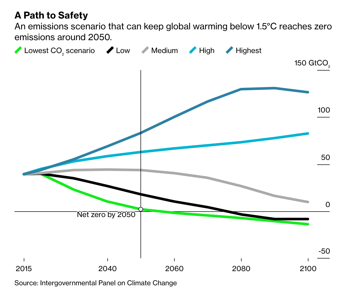
The way out is to hit zero emissions within 29 years. Via Bloomberg
The future imaginary

Zeke Hausfather points out that one scenario that limits warming to 1.5ºC by 2100 needs a lot of carbon removal. Specifically, it depends on 430Gt of carbon removal over the next 80 years or so. (More detail on that scenario from Hausfather is here.)
According to the Global CCS Institute, the global carbon capture market totalled some 40 megatons in 2020. This scenario calls for 5Gt of carbon removal by mid-century (representing a roughly 17-18% annualised increase in capacity between now and then) and 17Gt of carbon removal by 2100.
We’ll need to more than double down on new carbon capture technologies (not limited to carbon capture and storage (CCS) but also direct air capture, as well as scaling nature-based solutions.) Ultimately, this scenario requires what can only be called geoengineering. Via Zeke Hausfather
A bright dull spot

Two interesting aspects of geoengineering. It is already the case that several man-made activities are reducing warming, mostly by reducing solar radiation effects. Today’s human influence on the global temperatures of +1.1ºC, comprised 1.5ºC from greenhouse gases and -0.4ºC from aerosols and other things that are reducing heating effects. Of course, many of those aerosol effects involve the fine-particle pollution that causes about a fifth of all premature deaths around the world. My point is rather that we have some empirical backing that we can engage in solar radiation modification and that it is effective in reducing global average temperatures. Via Bloomberg.
We’ve done it before

We have experience with large-scale geoengineering projects. As EV reader, Oliver Morton, writes in his stunning book The Planet Remade: “If geoengineering means a large scale, purposeful technological manipulation of the earth system towards a given end, then what happened to the nitrogen cycle in the century following Haber's breakthrough is the best and most dramatic example that history provides.” What we have achieved in nitrogen fixation - through artificial mechanisms - dwarfs the natural cycle. Via Current World Environment
Bright tipping points

There are tipping points in the business and energy systems that allow us to reduce emissions faster than the IPCC forecasts. Specifically, the non-linearities that exist within exponential technologies applied to systems with feedback loops. These can create rapid phase changes. In last week’s EV, we explored those in the context of RethinX’s new report. Via RethinkX
Additional tipping points abound

CarbonTracker, another analyst firm, also points to tipping points that could foster a cascade in decarbonisation. For example, they point to the regular downward revisions of future oil demand from the oil industry itself. (The report has many more good examples of such tipping points.) Via Carbon Tracker
Change is possible

South Australia has proved that, even without much national government support, decarbonisation is possible. There is a renewable revolution taking place there driven by two forces: the exponential decline in solar and wind prices and the fact that the grid can decarbonise through a mix of smaller and large scale investments. Think rooftop solar and the Tesla Gigabattery. Via WEF
DEPARTMENT OF AUGUST
Stronger than a grizzly bear?

Illuminating data on how many Americans feel they could defeat a grizzly bear or elephant with their bare hands. Via Emily Bell
More expensive and less great

The American health system is more expensive and has lower system performance than other advanced economies. Interestingly, the leading countries tend to cluster together. Via Betsey Stevenson
Endnote
In my 2020 predictions, I argued that not only would climate change become the dominant narrative (that was easy to predict) but exponential technologies and smart founders could play a part in mitigating some of the worst effects while building a smarter, greener economy. Here is a long portion of what I wrote in my predictions:
Climate change will be the dominant narrative. We will achieve global peak emissions this decade, as Michael Liebreich argues. I believe we can go further than that. Renewables are cheaper than most forms of new fossil fuels and are getting progressively so, even when you add the costs of storage. Founders I meet are bringing the same entrepreneurial skillset that brought us Facebook, Google and Amazon to the climate change problem, including those hard-to-decarbonise sectors (like steel or chemicals). Governments, like the EU and the UK, have announced net-zero targets to be enshrined in law. And the financial markets are under pressure to better price in carbon risks, which will increase the financing costs of climate-deleterious investments relative to clean ones.
What we can’t be certain of is how rapidly our climate is changing (something we discuss in this briefing call with one of the lead authors of the IPCC 1.5 degrees report, Professor Myles Allen). The speed of this change will determine how we shape our investments into urgent mitigations and disaster relief against sustained investing in shifting our energy mix. We’ll probably need to do both. Addressing climate change will require a concerted effort of World War II scale, but a genuinely global one. During 2019, I had dozens of conversations in boardrooms, with public market investors, entrepreneurs and venture capitalists which lasered in on the imperative to achieve net-zero. So perhaps we have a chance to launch a modern-day Manhattan Project to tackle climate breakdown.
This week’s IPCC report reinforces the importance of that mission.
Would love to hear your reactions & thoughts in the comments. To comment, simply click on the headline of this post and scroll down to the comment box on the page.
Cheers,
Azeem
How happy are you with today's edition?
Unhappy | Meh | It's good | Great | Extremely happy, will forward